Hypercube LMS
Hypercube is a learning management system (LMS) designed specifically for use with the Amco® learning system, that makes it easy to create and manage learning activities, whether it’s training students and teachers, building online courses, or tracking school staff performance.
The Challenge
We needed to create a new platform for our educational community, providing personalized access for different user roles, along with the following modules:
• Administration
• Calendar
• Learning Content
• Control panel
• Communication
• Project Based Learning
My Role
I led the Product Design - User Experience (UX) and User Interface (UI) - of this project from August 2019 to December 2019, and received constructive feedback from two fellow designers. I also collaborated with a Project Manager, the Development team and interviewed with stakeholders to improve and get other perspectives on what I was designing.
Main Tasks
1. Product Owner and Stakeholder insights
2. Project Scope and Vision
3. User Interfaces and Experience
4. Interactions
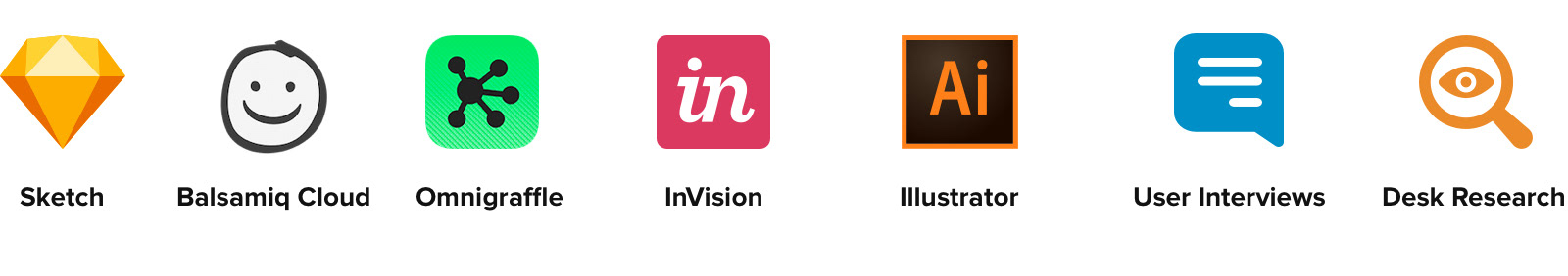
Design & Research Toolkit
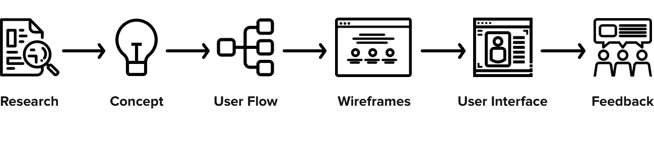
Design Process
To start off, I conducted user interviews and desk research to get a clearer understanding of how similar products and our users behave. Having this information early in the project gives me a clearer path when coming up with ideas for prototyping.
Once this information was collected, I started working on a solution, using wireframes and user flows to iterate faster through ideas. Afterwards, I started designing the interface following fundamental design principles such as contrast, visual hierarchy and feedback, brand attributes and user interactions.
With the interface ready, I presented to the rest of the UI/UX team which, provided invaluable feedback regarding experience gaps.
User Interviews
As one of the basic methods of designing the user experience, I chose to conduct interviews with 12 people, 6 teachers and 6 students. I considered that to be a sufficient sample size to begin generating concepts and hypothesis.
After the concept phase, I’d test the prototype with a different set of users to gather more information.
The interview took approximately 20 minutes and included topics to get to the core of what actions users valued more and what their most common problems were.
Some of the questions asked were:
• Briefly describe how you teach a class during a normal workday.
• What activities do you dedicate more time to during your class?
• How do you apply teamwork dynamics during class?
• What tools do you use to share digital content with your class?
Customer Insights
After all the interviews had been conducted, the following information was considered the most relevant when coming up with the solution:
80%
considered students being able to collaborate online to be one of the most important features.
90%
saw digital interactive content as the most effective way to engage newer generations and to get them to actively participate in their own learning experience.
70%
said they did not have the necessary tools to effectively share digital content with the class.
50%
considered gamification to be an added benefit when creating their class.
We can see from the data that although 90% of users consider using interactive digital content as the most effective means of teaching, 70% feel they did not posses the necessary tools to share this content with their class.
Desk Research
Additionally, I conducted a competitor analysis to better understand how other Learning Management Systems behave and could be improved on.
The article Innovative LMS Features: Real or Hype? by John Leh was very helpful in analyzing new functionalities through the lens of our specific business priorities and our ability to measure the payback on investment.
Some of the main competitors researched were:
User Flows
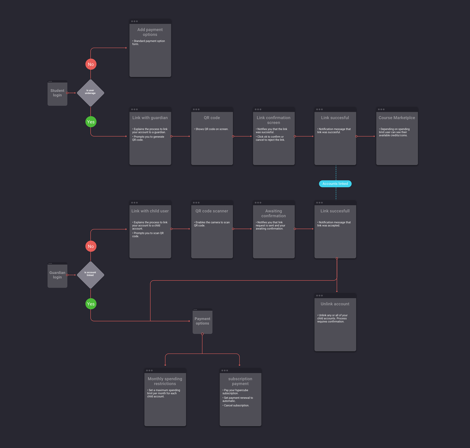
User flows were created to visualize the primary interactions, such as login, class enrollment, purchase, reports, etc.
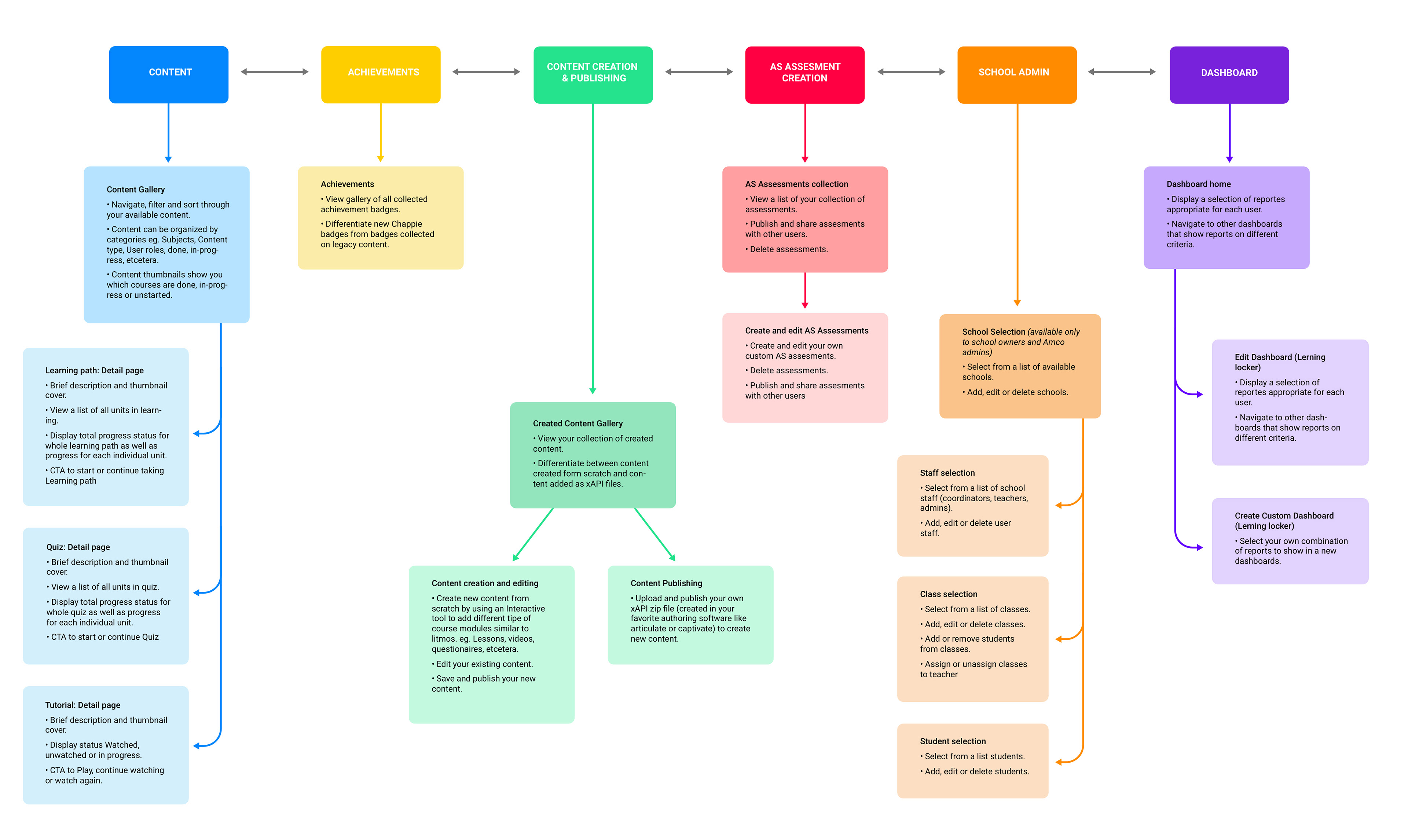
Sitemap
The sitemap was designed to detail the structure of the application, defining taxonomies through grouping of related content. It helped us ensure content is in places users would expect to find it.
It also served as a reference point for wireframes, functional specifications and content maps.
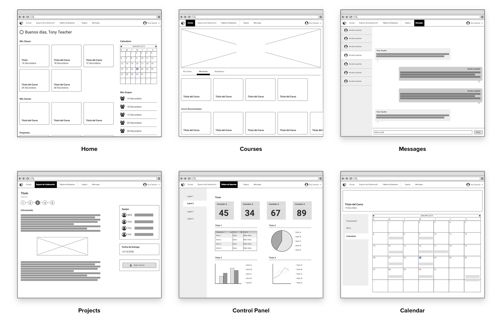
Wireframes
The Wireframes were used to build the information architecture and as a starting point to kickoff the Interface Design phase.
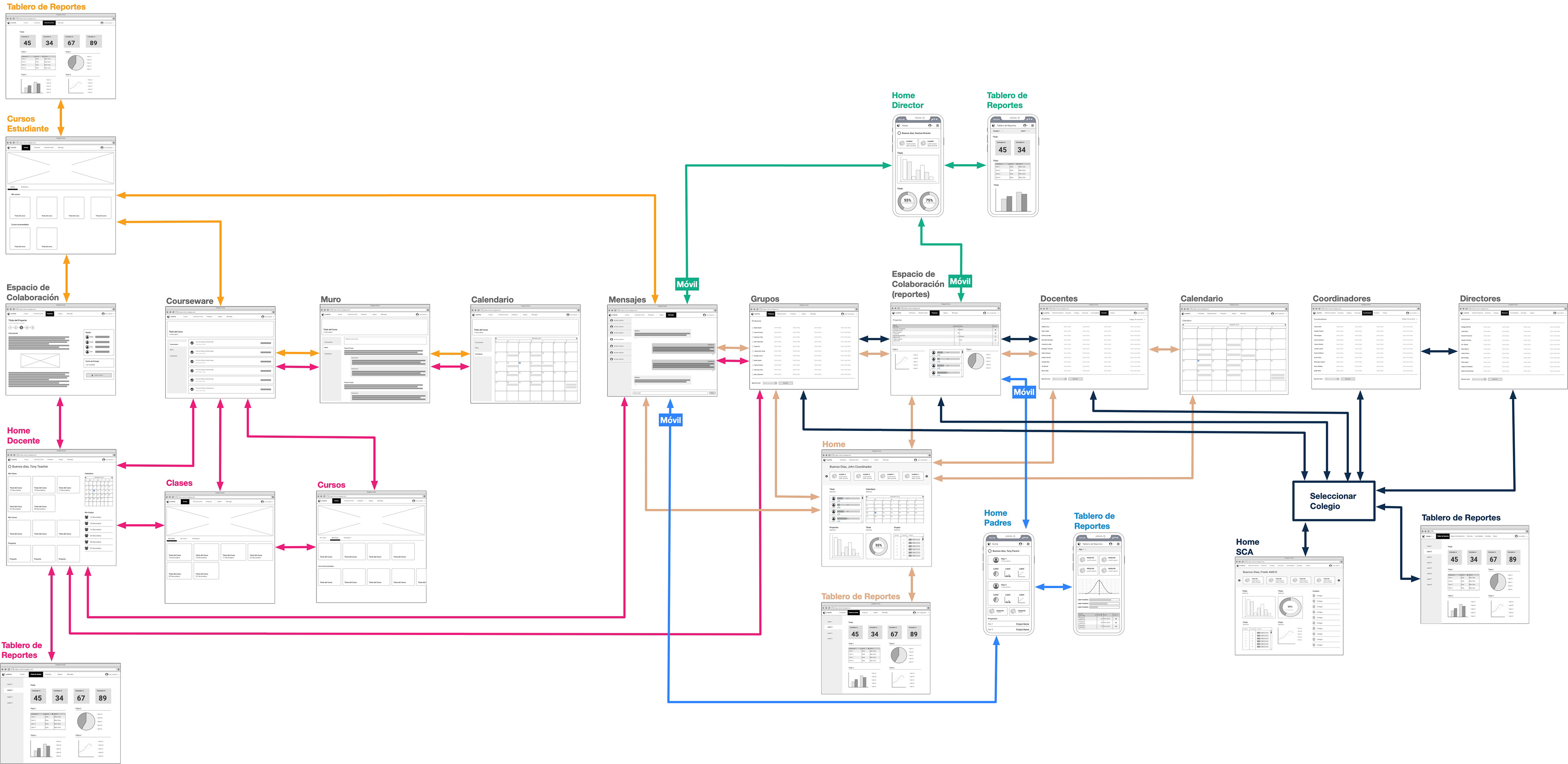
User Roles
This diagram records the different interactions our user roles have with each other and the application itself.
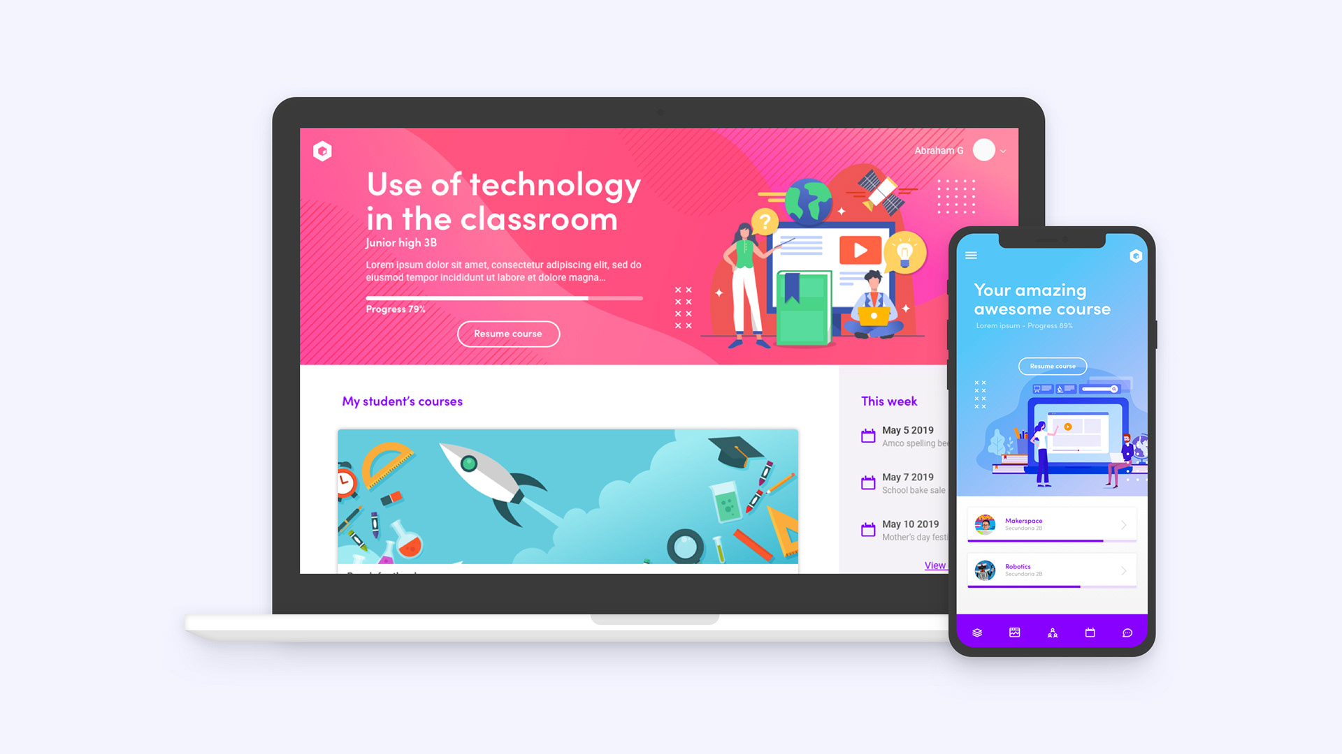
User Interface
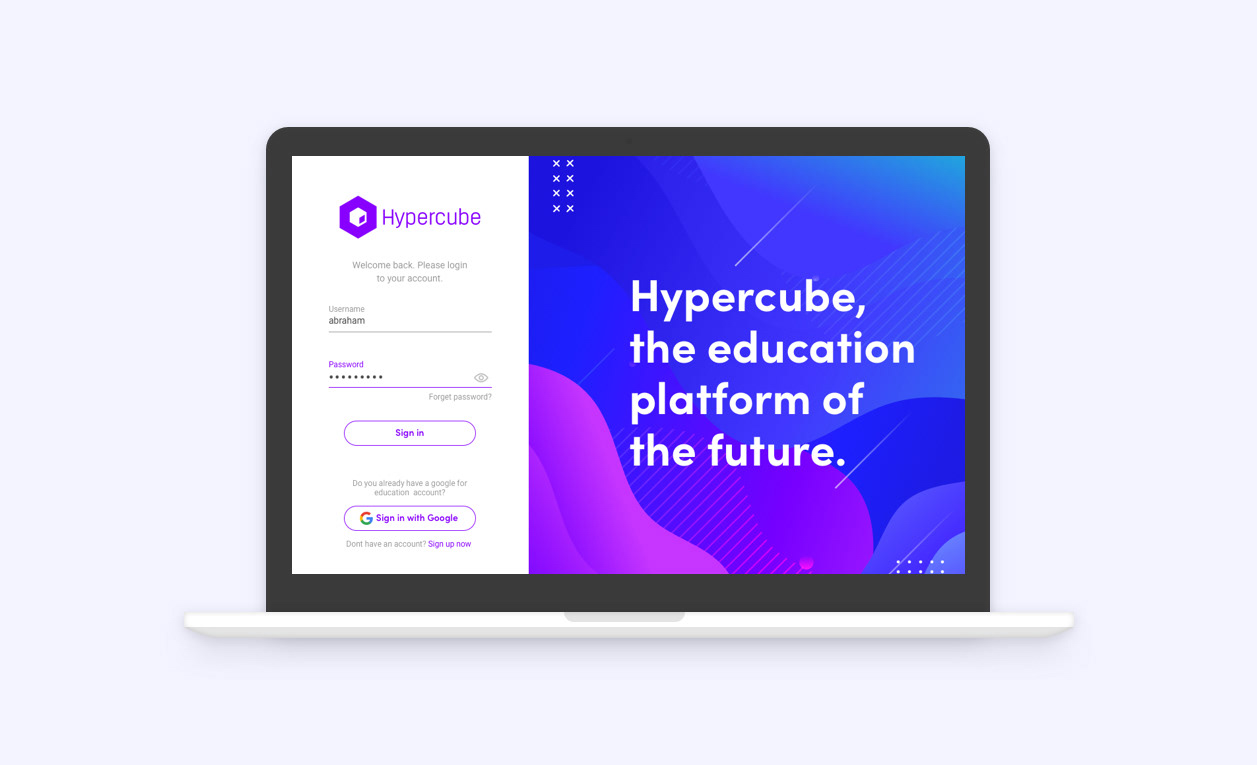
Login
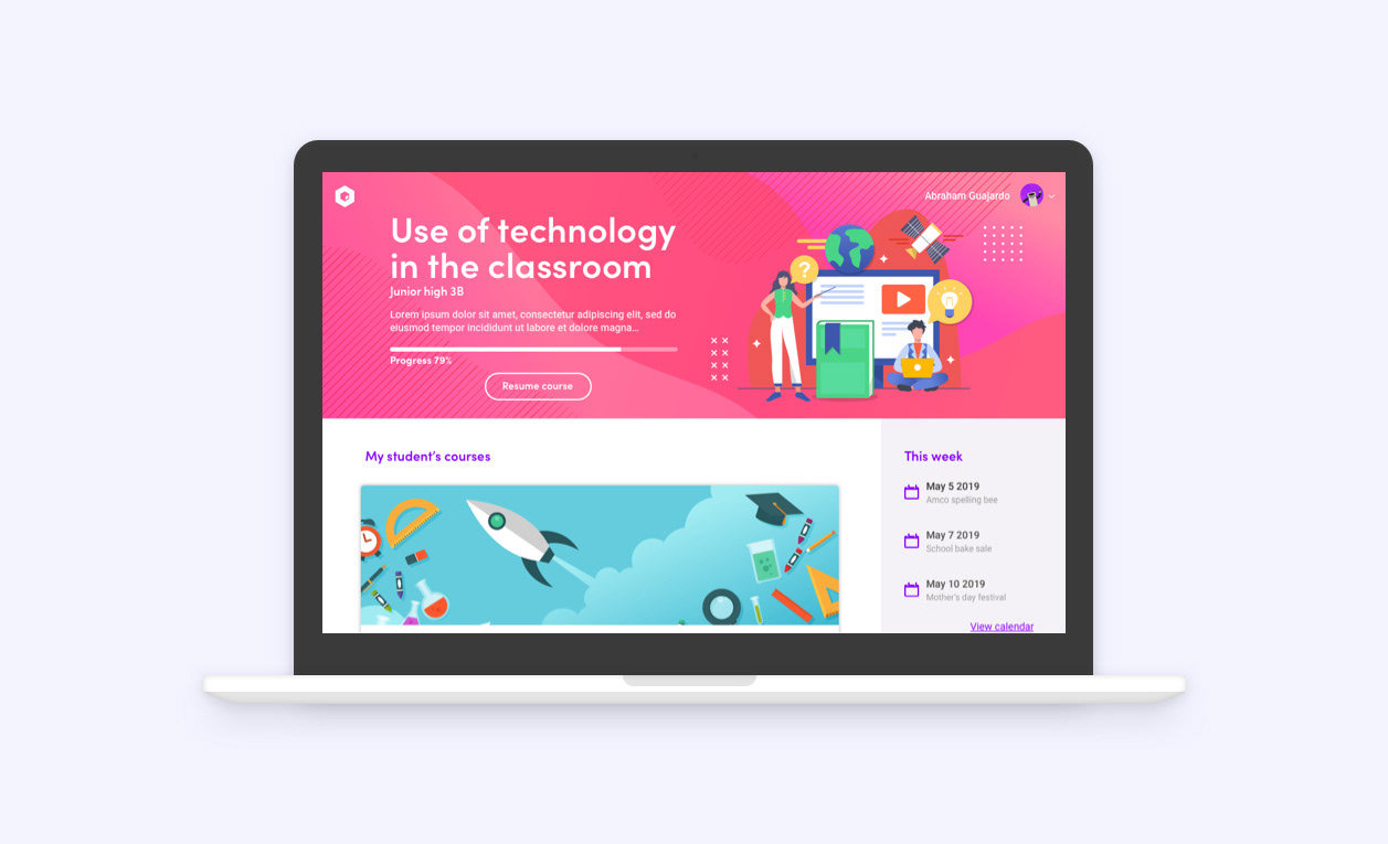
Home
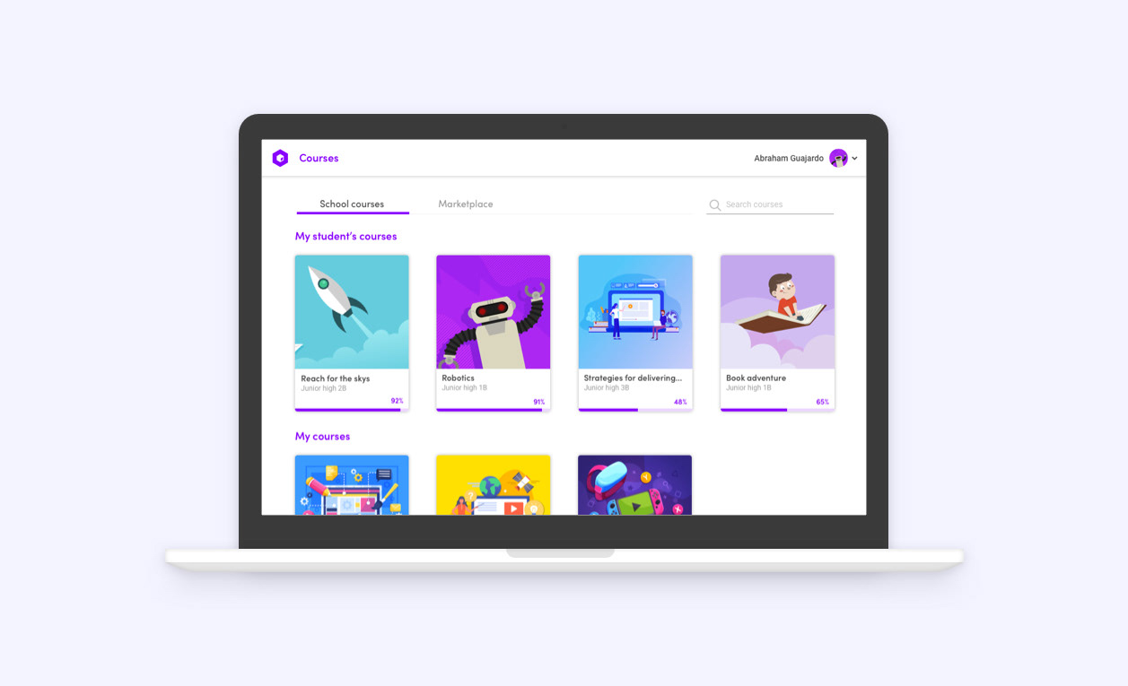
Courses
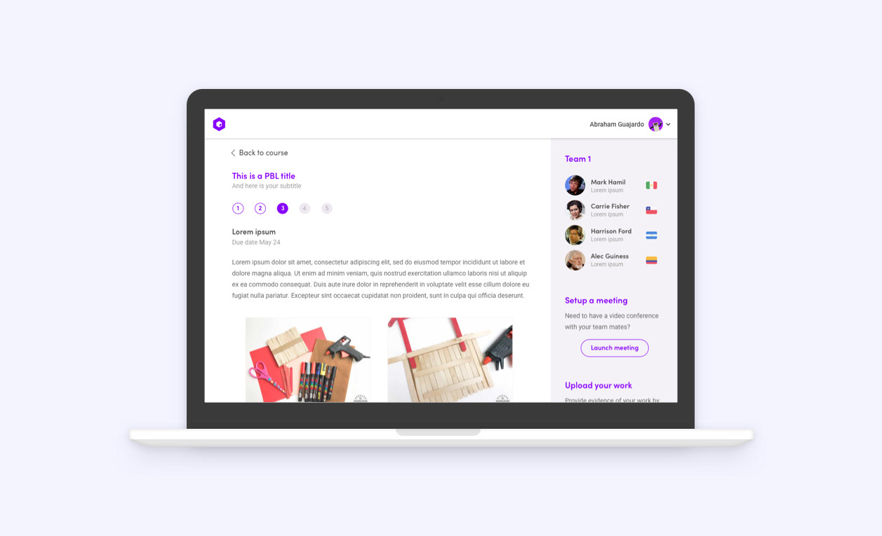
Project Based Learning (PBL)
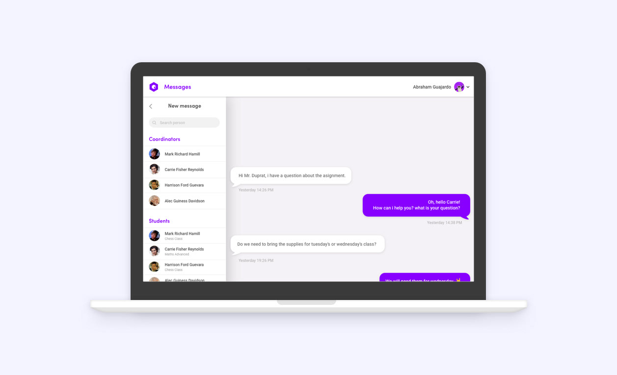
Messaging
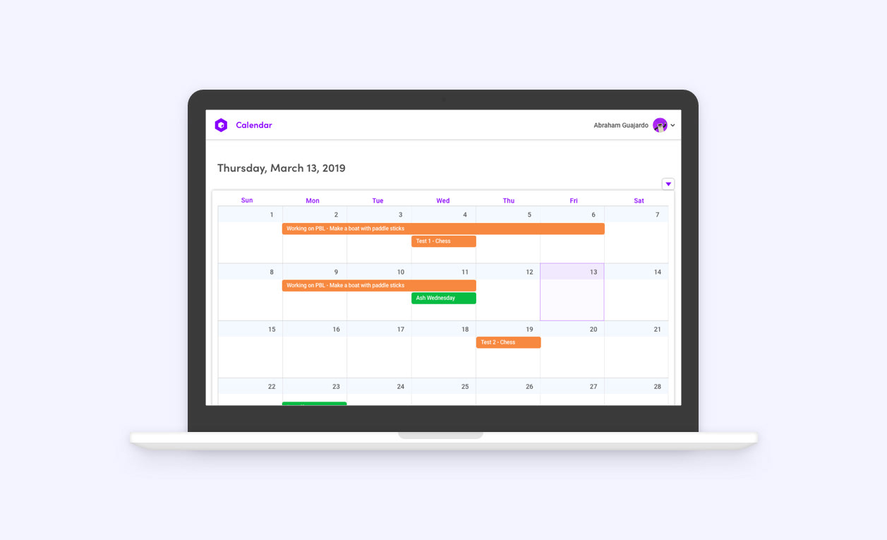
Calendar
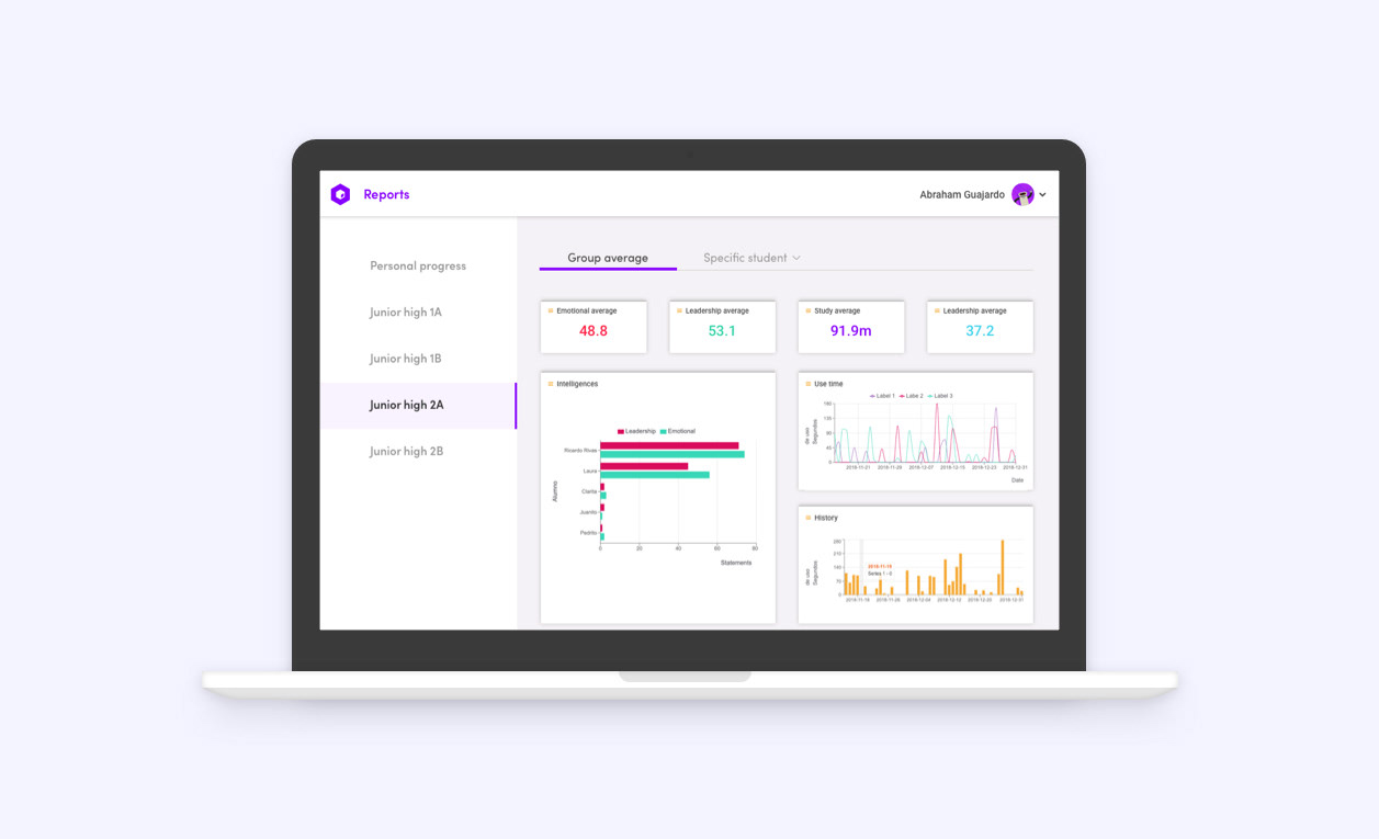
Reports
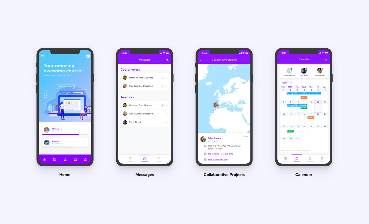
Mobile
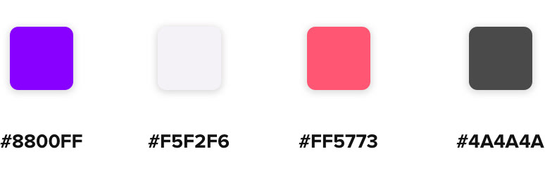
Colors
I was looking for a playful and energetic tone, so I chose purple to break the white and make the brand look youthful and exciting.
Magenta was added as well to give the interface a warmer look and contrast with illustrations.
For text, a much darker variation of purple has been brought in to ensure reading and contrast, thus reaching appropriate levels of accessibility.
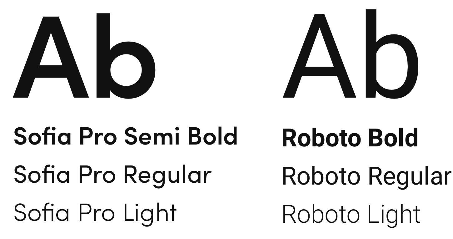
Typography
Thanks for reading!
I'm currently available for new projects.
Send me a message and let's discuss how I can help you.